Ąžuolų Ūkis
Ąžuolų ūkis
Client — Murvela, UAB
Services — Naming, Logo design, Packaging design
Year — 2017
Many of our clients are small fish in a big pond. This was also the very similar and recognisable case for us. After many unsuccessful attempts to ensure shelf space at biggest supermarkets they came asking for help.
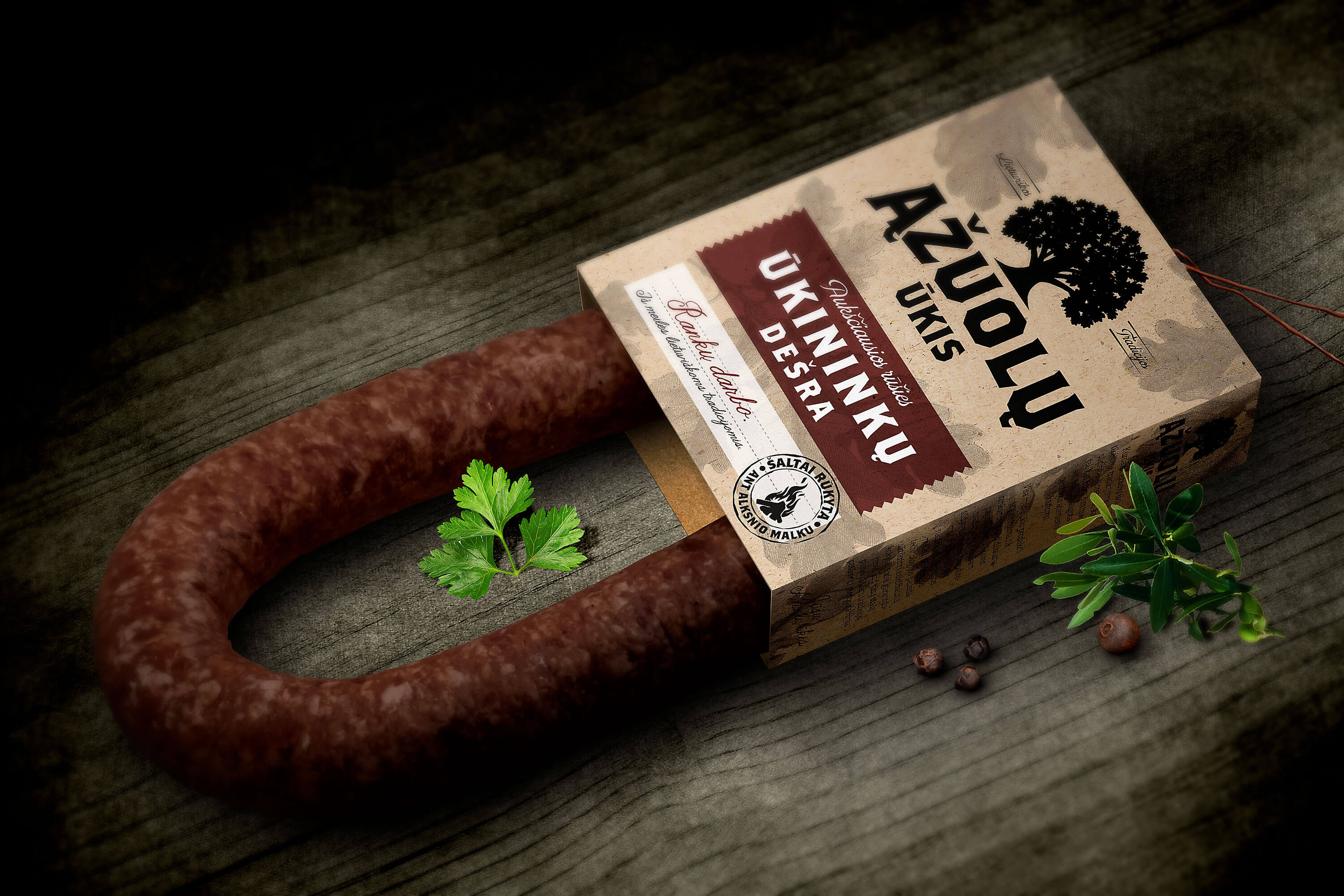
Our journey together began creating strategy for the new brand and packaging which should attract retail customers as well as large distributors. Decision was made to leave the old brand name behind and creating new one and naming it “Ąžuolų ūkis” which literally translates as Oaks farm. Oak being the symbol of strength and masculinity in Lithuanian folklore. This came up to be really good idea for naming a homemade style smoked meat products.
Communicating old fashioned real smokehouse experience as well as distinguishing production of “Ąžuolų ūkis” from other bigger brands, instead of plastic craft paper packaging was used. Also it was important to let the customers feel the incredible real smoked meat scent. So packaging was left open as to spread the pleasant odours and even attract customers looking for handmade meat products. Graphics complemented all over looks of the packaging with low intensity dark colours stamp like elements and handwritten typefaces to strengthen the idea of “farmers produce”.
We are really happy that this came up to be an outstanding product and even became bestseller in most popular supermarket in it’s niche. Customers fell in love with the packaging concept and the product quality. Sales exceeded the clients expectations and not long after the brand was awarded by the biggest retailer as the Debut of the Year.