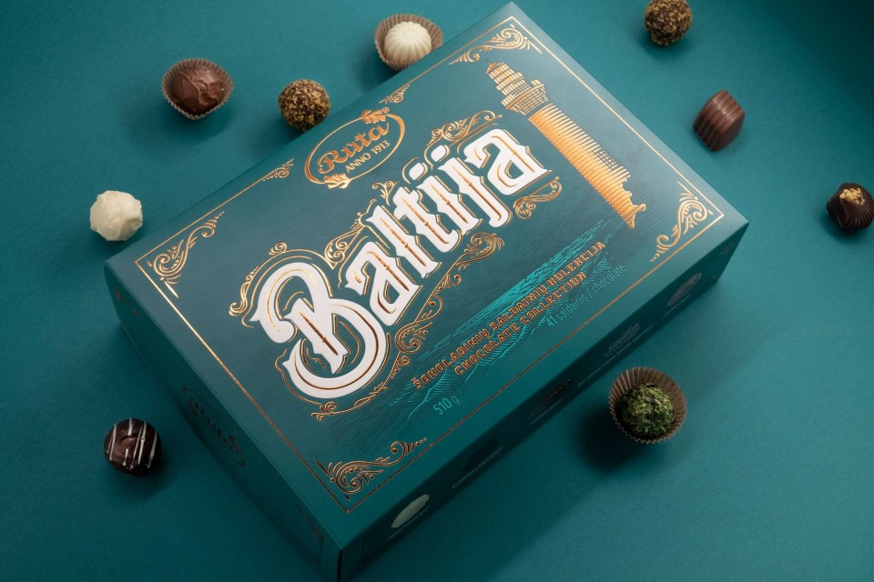
BALTIJA – Chocolate Collection
Cient – Rūta, UAB
Services – Packaging Design
Year – 2020
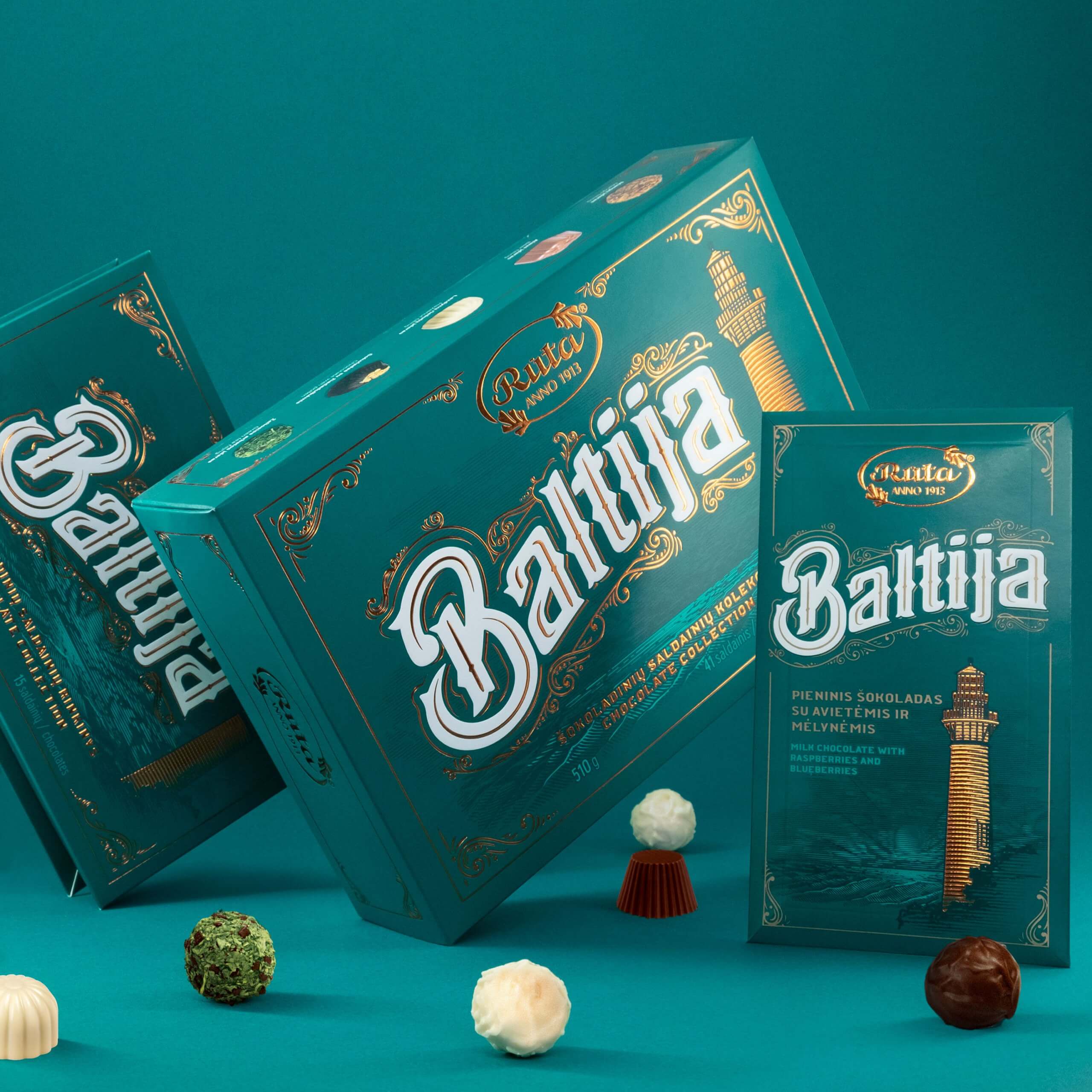
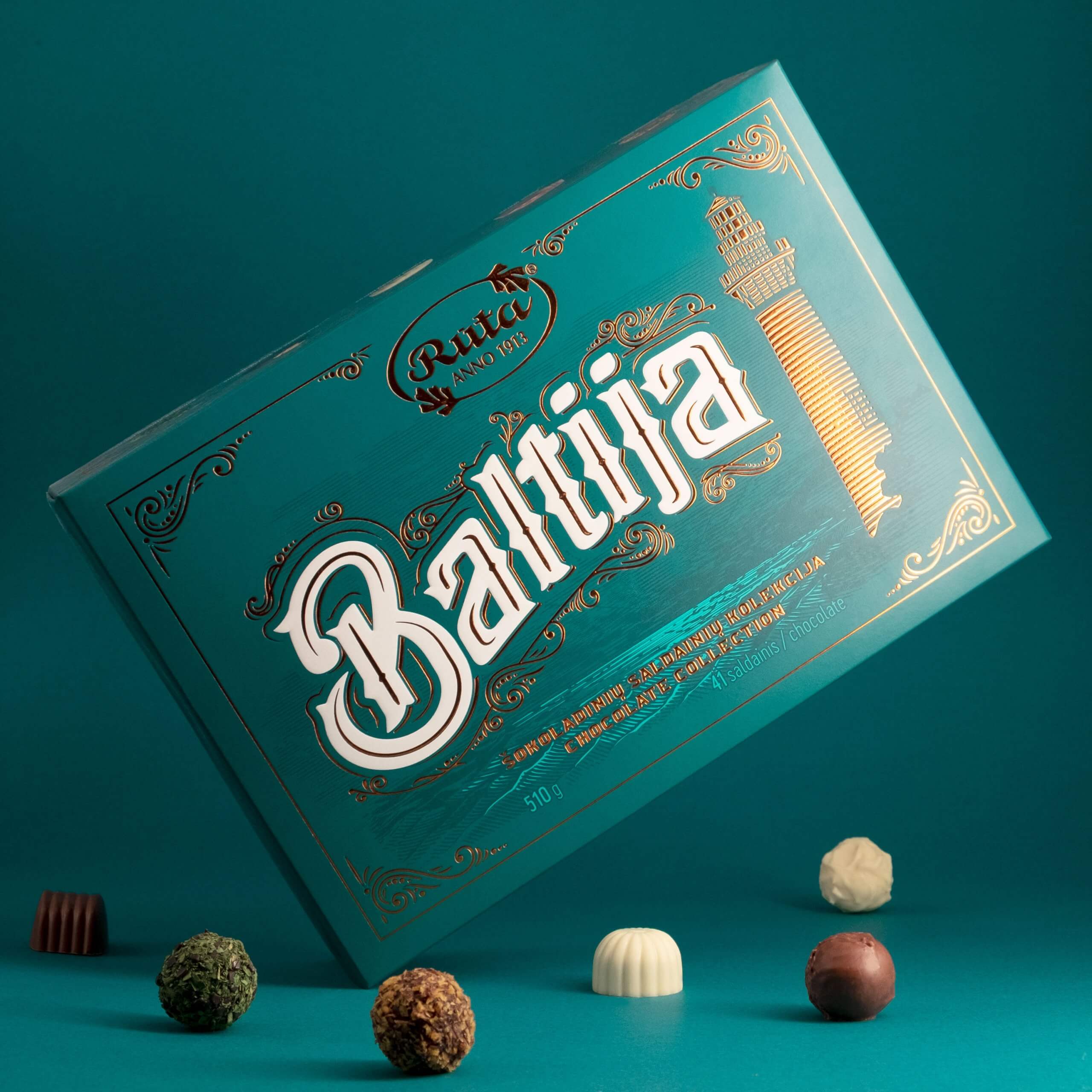
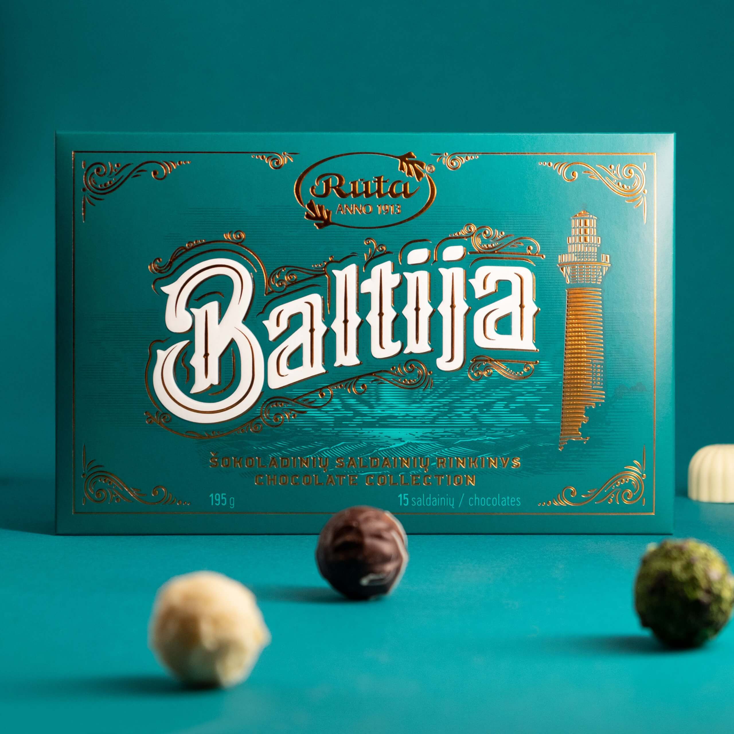
Confectionery name Baltija came from name of the Baltic Sea in lithuanian. The sea was the main inspiration of this project. It is neighbouring 8 countries, which are all different. Sea is calm and do not carry its own identity as such. That is why the lighthouse was selected as the main symbol of the packaging. Sea also was the inspiration when picking colour. Deep greenish blue colour gave vibrance and luxury feel letting it stand out in the context of confectionery packaging all over the baltic region.
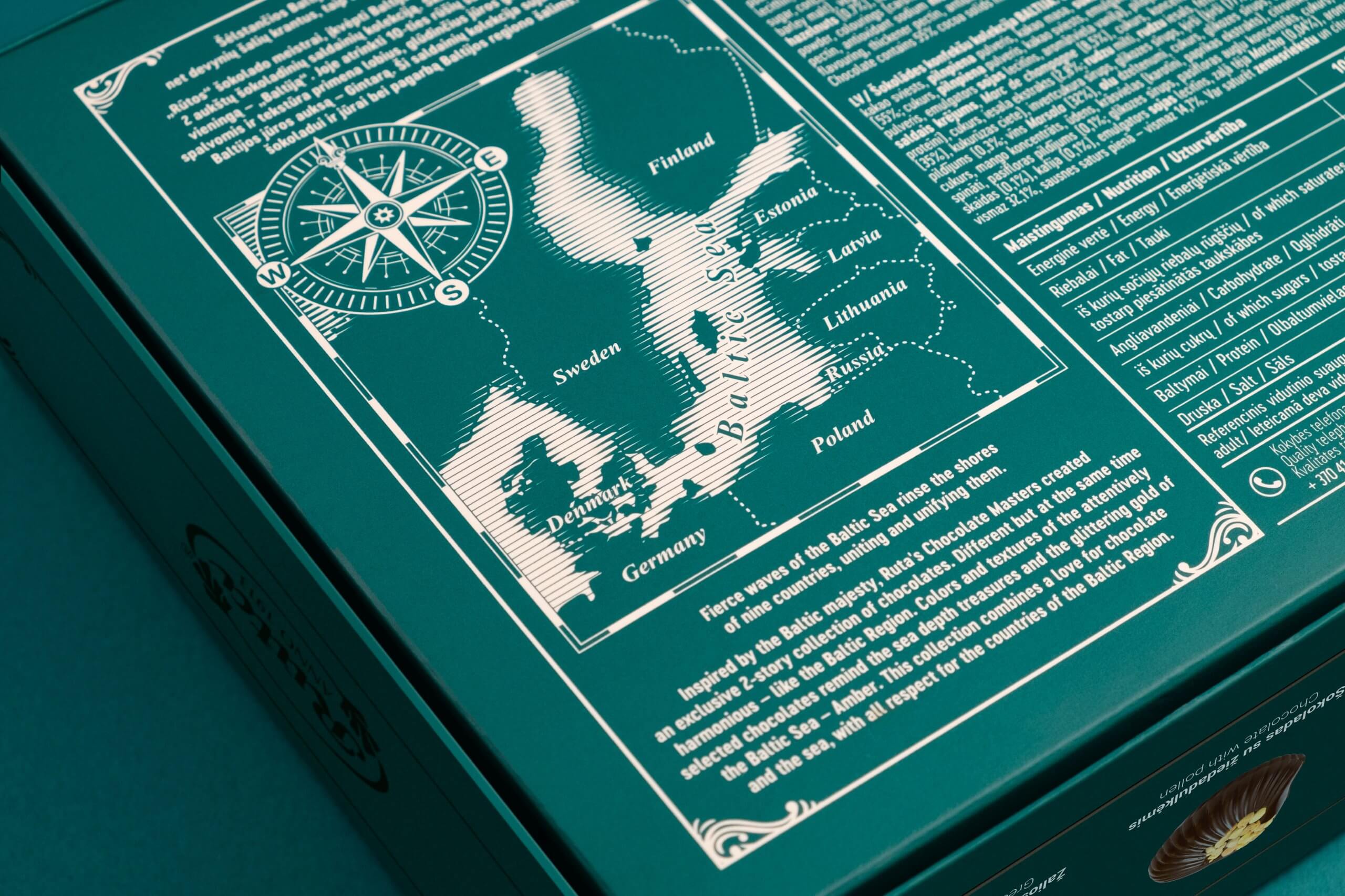
All countries that are bound to baltic sea are unique in their own way. That is why no specific graphic elements were used that would indicate on country or another. Design was thought to be as timeless as possible so classic victorian style illustration were created. This style is full of wavy and dynamic forms that resembles sea movement and volatility. Background contains unique sea scenery together with lighthouse in the foreground connecting it all together.
Three separate packages were created for this product line. One of the boxes containing more than fifty candies plastic usage was reduced and paper separations were introduced. Fifteen candy box was decorated with uncommon type of cover giving overall packaging more elegance. To extend same visual experience chocolate bar was packed in carton envelope containing the same graphics.
One of the most important task was to determine the consumer of the product. Research revealed that oftentimes it is bought as a souvenir from the baltic region. This gave an insight that it should not be associated with one country and it also should communicate the Baltic sea more than box contents. Appearance is really important part of package which is intended to be the gift. Extreme attentions was given to details as well as overall package aesthetics to trigger positive emotion to the end user.

