Organic Way
Client — Sėklos LT, UAB
Services — Packaging & Logo Design
Year — 2019
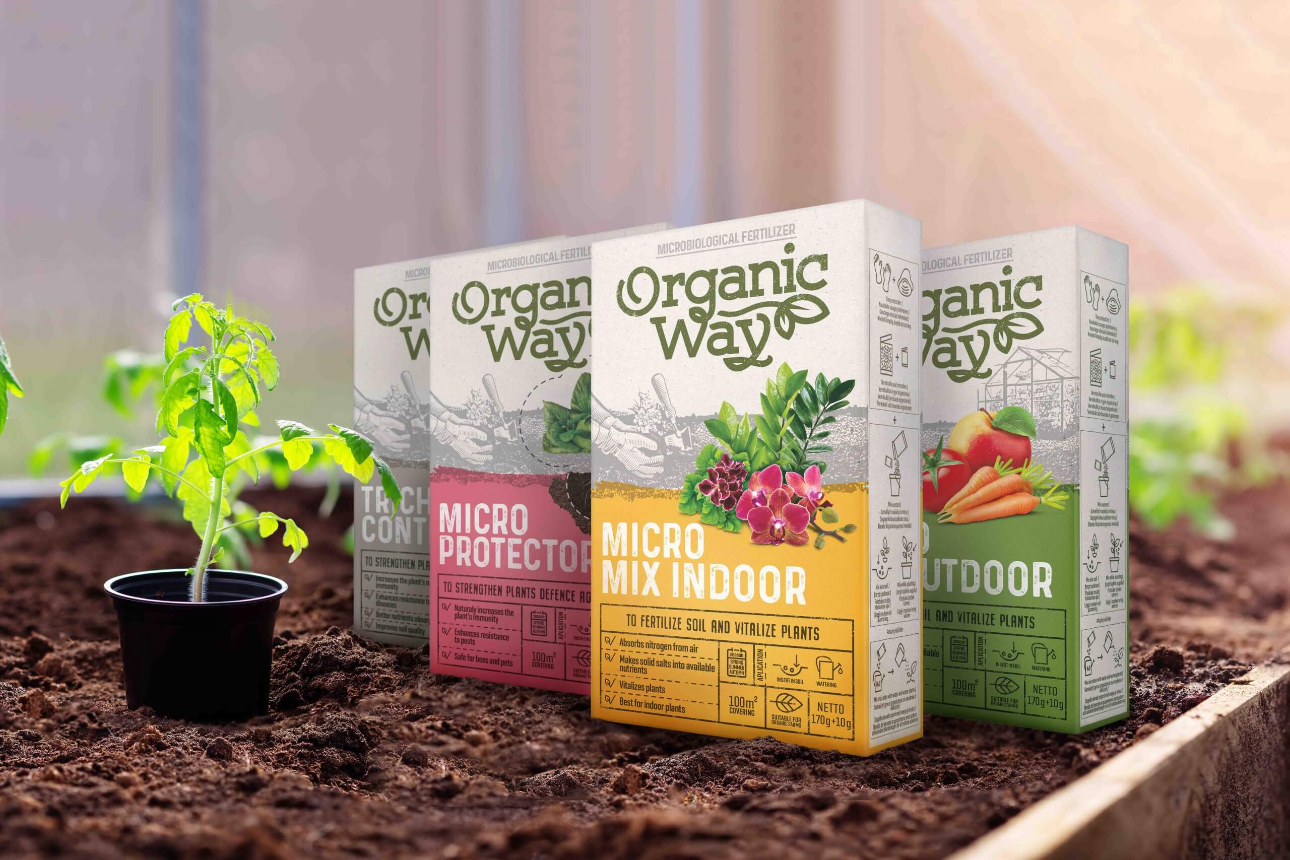
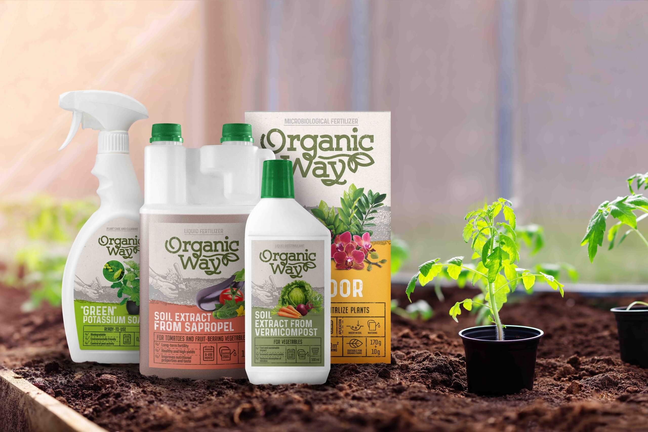
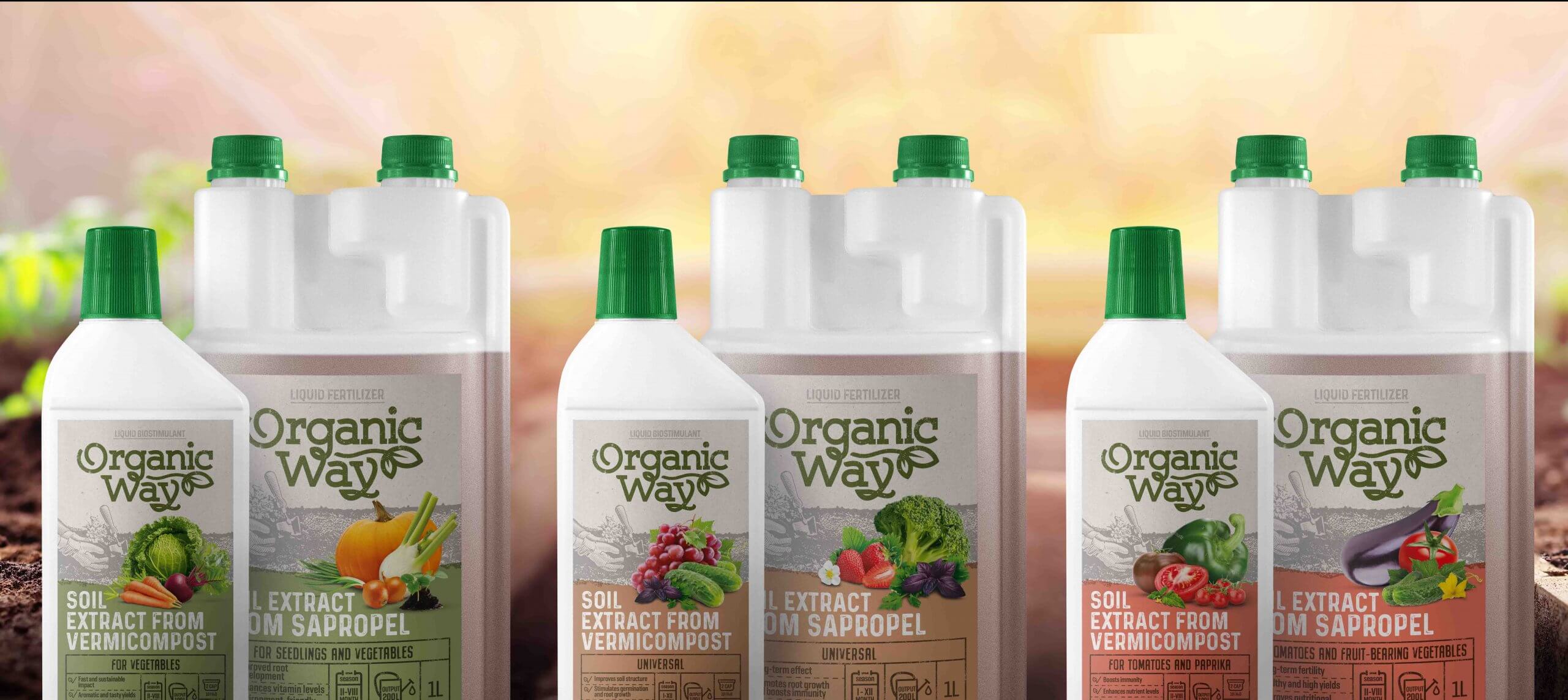
This is an organic fertilizer for small homeowners. For those who are gardening enthusiasts and want to grow their healthier vegetables, fruits or nurture their garden.
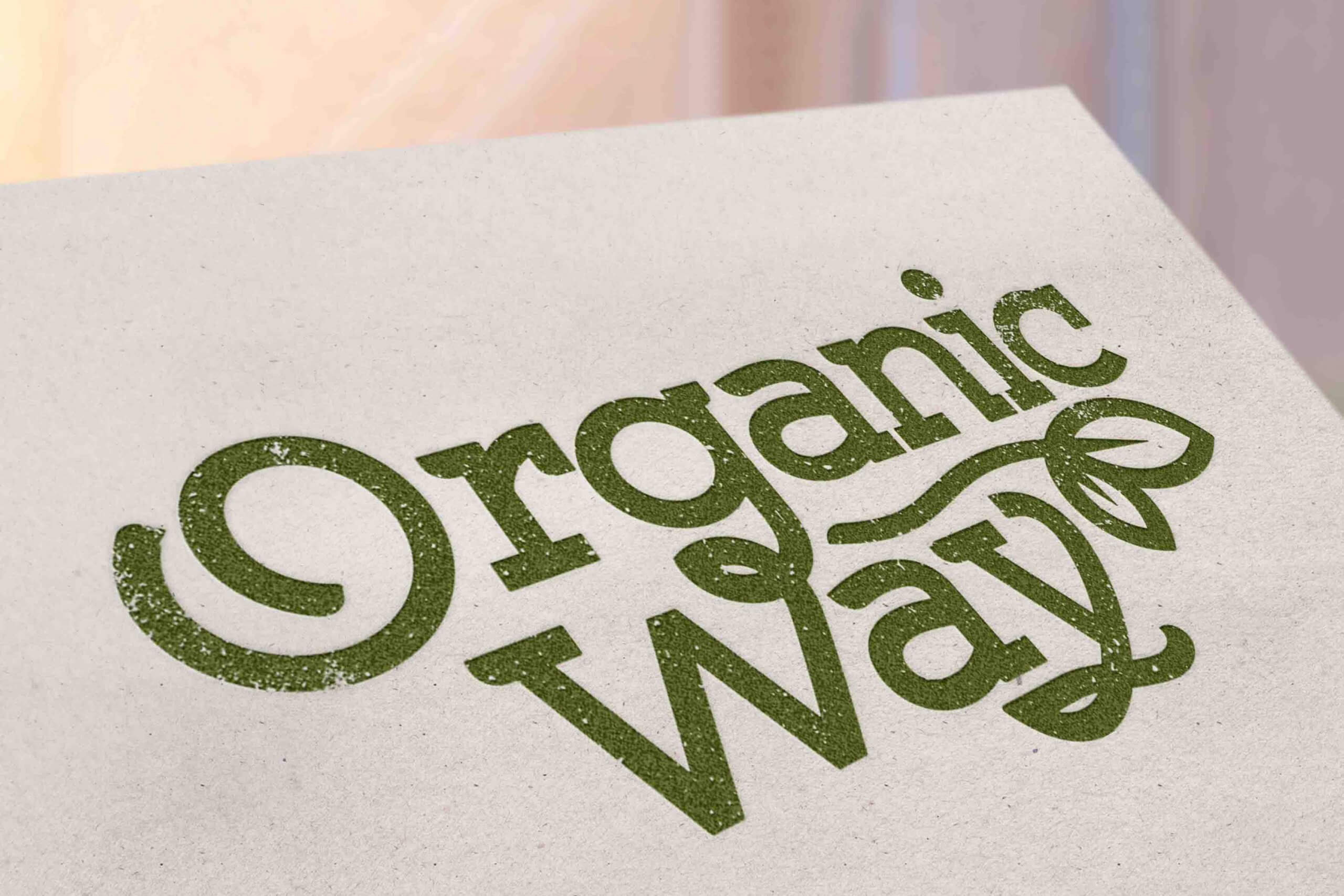
We paid a lot of attention to the ORGANIC WAY logo and the idea was that the logo should speak for itself foor being an organic as much as possible. By choosing the colour green, the motifs of the leaves we let the user understand that it is intended for plants. Selected base font with a touch of worn out look provides associations with ecology, simplicity and warmth.
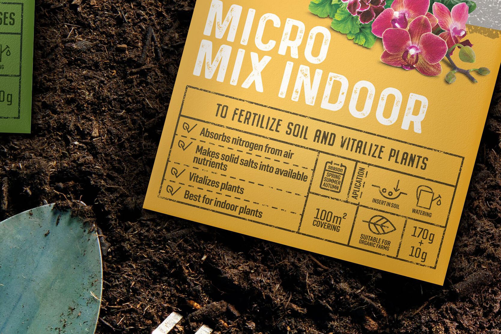
For the backgrounds of the packaging, we chose coloured kraft paper, which is clearly visible and evokes warm emotions. The most important thing in structuring information was to help the consumer understand the differences, communicate the result clearly, and inform how to use it. We created informational table specifically for this reason, which would quickly communicate all the necessary information to the consumer and without a need of reading the back side of the package. Large fruits, vegetables or flowers allows to quickly identify the intended use of specific fertilizer.