Situation
The product looks cheaper than it is and fails to attract new buyers. Market share is rapidly declining. The brand is losing relevance.
Objective
To redesign the packaging while revitalizing one of Denmark’s oldest coffee brands. To create a more premium look while maintaining recognizability and retaining existing customers.

.webp)
Analysis & Insights
The packaging lacks a clear information hierarchy, and some of the icons may be misleading. Visually, it is a dull, generic, and cluttered design, where the dominant retail chain logo emphasizes the private-label image and reduces perceived value.

Incorrect hierarchy of elements. The logo is not visible. The brand is unclear.

The product name and brand name are difficult to identify.

Informational symbols are used without context, failing to provide clarity and potentially misleading consumers.

A dull, generic, and visually noisy background that adds no value.

The retail chain logo highlights the product as a private-label brand, reducing its perceived value in the eyes of consumers.
.webp)
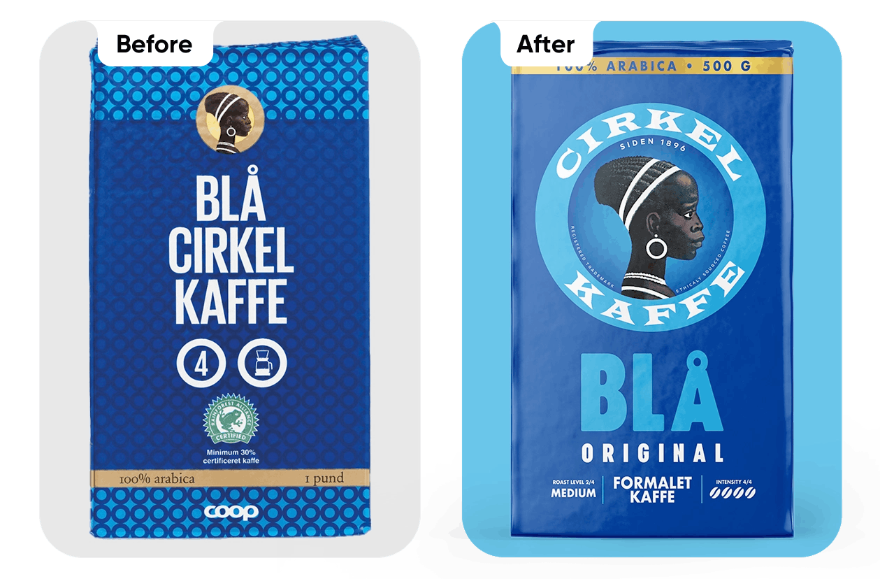
Results
The redesigned packaging puts the historic brand symbol — the “coffee girl” — at the center. The brand’s heritage-rich identity has been reinterpreted in a contemporary way. The product name is clearly communicated, and the information structure has been reorganized.
What's new?
Strengthened visual hierarchy
Brand heritage integrated in a modern way
Clear and functional information structure
Stronger shelf impact

Projekto sėkmė

Pasitenkinimas rezultatu

Project Gallery
.webp)
.webp)
.webp)
.webp)
Daugiau projektų

Facing a challenge? Let's talk.
Get in Touch the Way That Works Best for You

Antanas Rimdžius
Projektų ir partneryščių vadovas
Antanas Rimdžius
Head of Projects & Partnerships
Antanas Rimdžius
Head of Projects & Partnerships

Book a Meeting at a Time That Suits You

Antanas Rimdžius
Projektų ir partneryščių vadovas
Book a free consultation at a time that’s convenient for you.


