Challenge
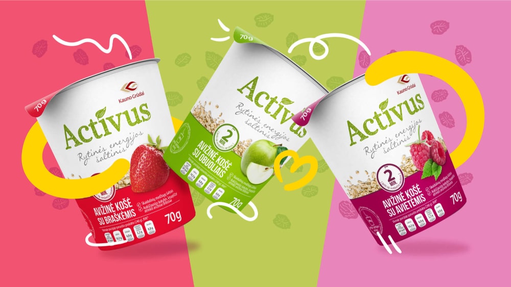
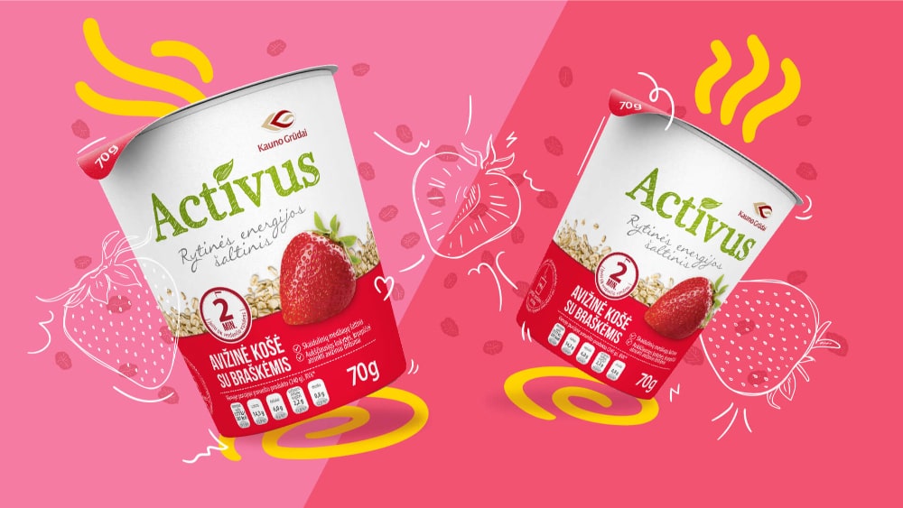
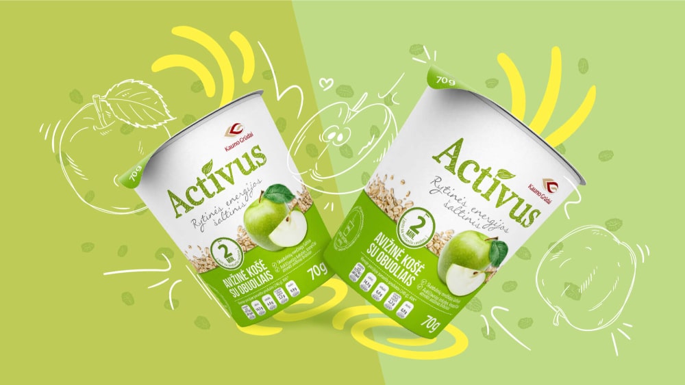
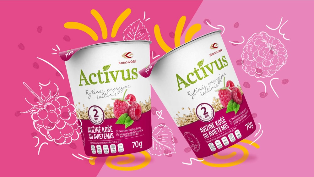
Kauno Grūdai — one of the largest companies in Lithuania, with a broad product portfolio. Bold Brands was tasked with creating the oatmeal packaging design and logo. The oats were to be supplied in a new type of cup that had not yet existed on the market, so special attention had to be given to the design and special attention was paid to differentiating it stylistically from competitors.
Solution
We chose modern minimalism: a clear, memorable logo and a clean layout without unnecessary elements. In the packaging, we focused heavily on explaining the product name and flavor; the slogan Morning energy was highlighted in the background — the first message a hesitant buyer notices. At the bottom we presented benefits and nutritional values, and we used a contrasting functional color to distinguish flavors so the cereals are instantly recognizable on the shelf.
Results
Although compact, the new packaging contains all the necessary information, stands out on shelves with its minimalist style and contrasting colors. The logo together with the slogan Morning energy clearly communicates the product, while functional color coding helps consumers quickly find the flavor they want, strengthening Kauno Grūdai’s image as an innovative and high-quality brand.
More Projects
Facing a challenge? Let's talk.
Get in Touch the Way That Works Best for You

Antanas Rimdžius
Projektų ir partneryščių vadovas
Antanas Rimdžius
Head of Projects & Partnerships
Antanas Rimdžius
Head of Projects & Partnerships

Book a Meeting at a Time That Suits You

Antanas Rimdžius
Projektų ir partneryščių vadovas
Book a free consultation at a time that’s convenient for you.


