Situation
The product looks cheaper than it actually is and does not attract the target audience.
Objective
Refresh the packaging design by emphasizing brand value and relevance.

.webp)
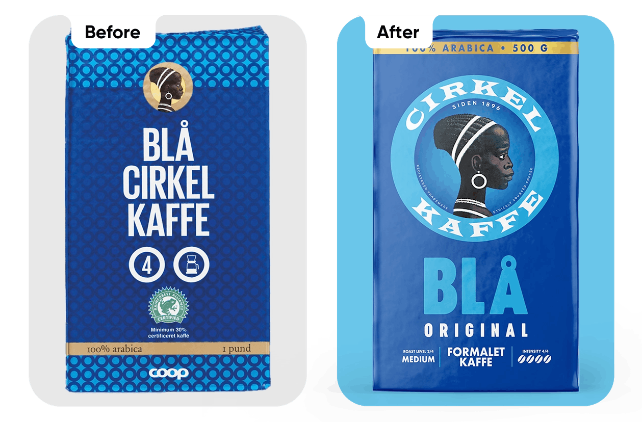
Analysis & Insights
The packaging lacks a clear information hierarchy and positioning.

Incorrect hierarchy of elements. The logo does not stand out.

The product and brand are difficult to identify.

Informational icons are used without context.

A dull, generic, and visually noisy background.

A retail chain logo suggests a private-label product.
.webp)
Results
The main focus was placed on brand storytelling and visual hierarchy.
What's new?
Strengthened visual hierarchy.
Brand heritage integrated in a modern way.
Clear functional information.
Improved shelf impact.

Projekto sėkmė

Pasitenkinimas rezultatu

Project Gallery
.webp)
.webp)
.webp)
.webp)
Daugiau projektų

Facing a challenge? Let's talk.
Contact Us in the Way That Works for You

Antanas Rimdžius
Projektų ir partneryščių vadovas
Antanas Rimdžius
Head of Projects & Partnerships
Antanas Rimdžius
Head of Projects & Partnerships

Book a Meeting at a Time That Suits You

Antanas Rimdžius
Projektų ir partneryščių vadovas
Book a free consultation and meet at a time that’s convenient for you.


