Challenge
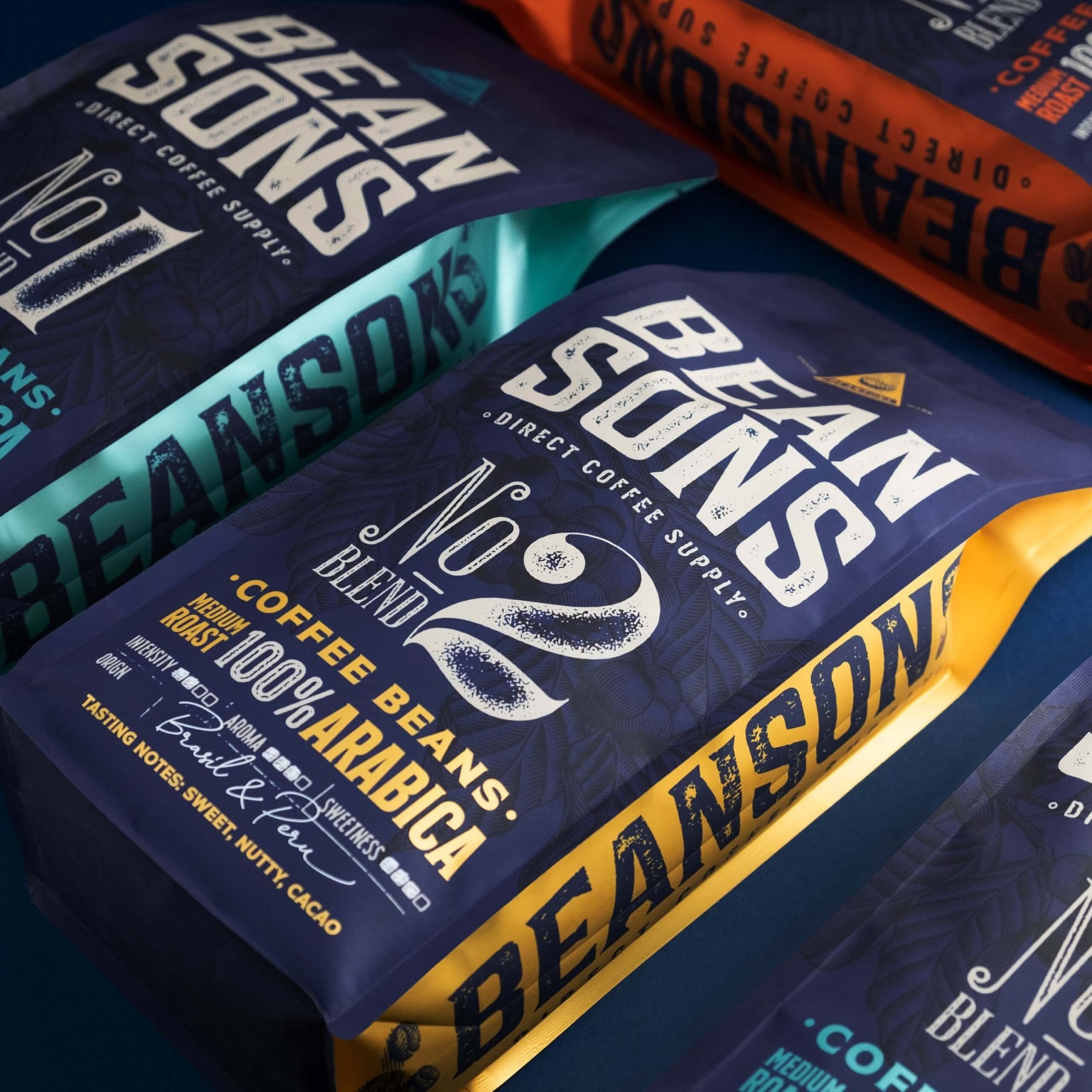
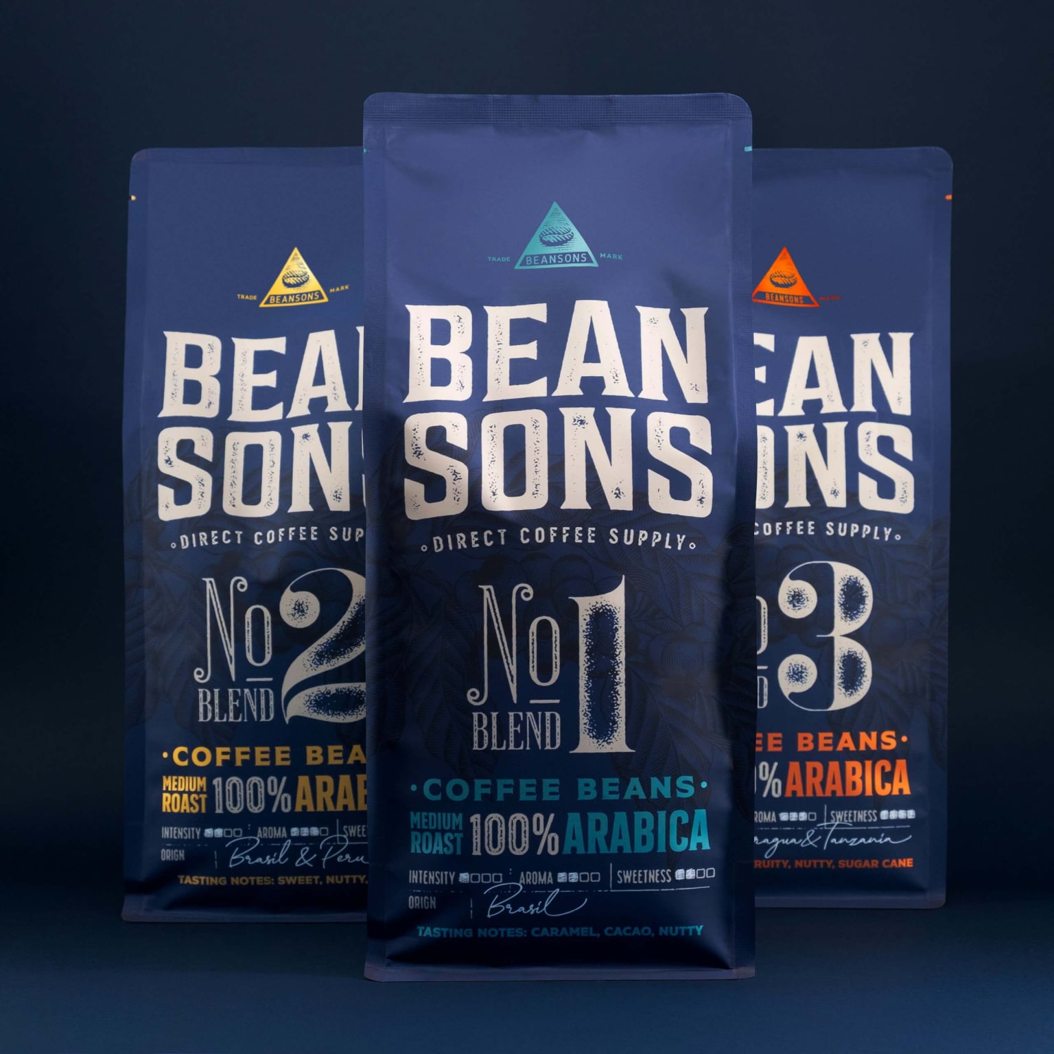
When creating the BEANSONS brand, emotions, authenticity, and aesthetics were key considerations. The brand and its packaging needed to tell a story and convey traditional values while ensuring success in the modern market. The name Beansons sounds as if the brand has existed since the mid-20th century.
Solution
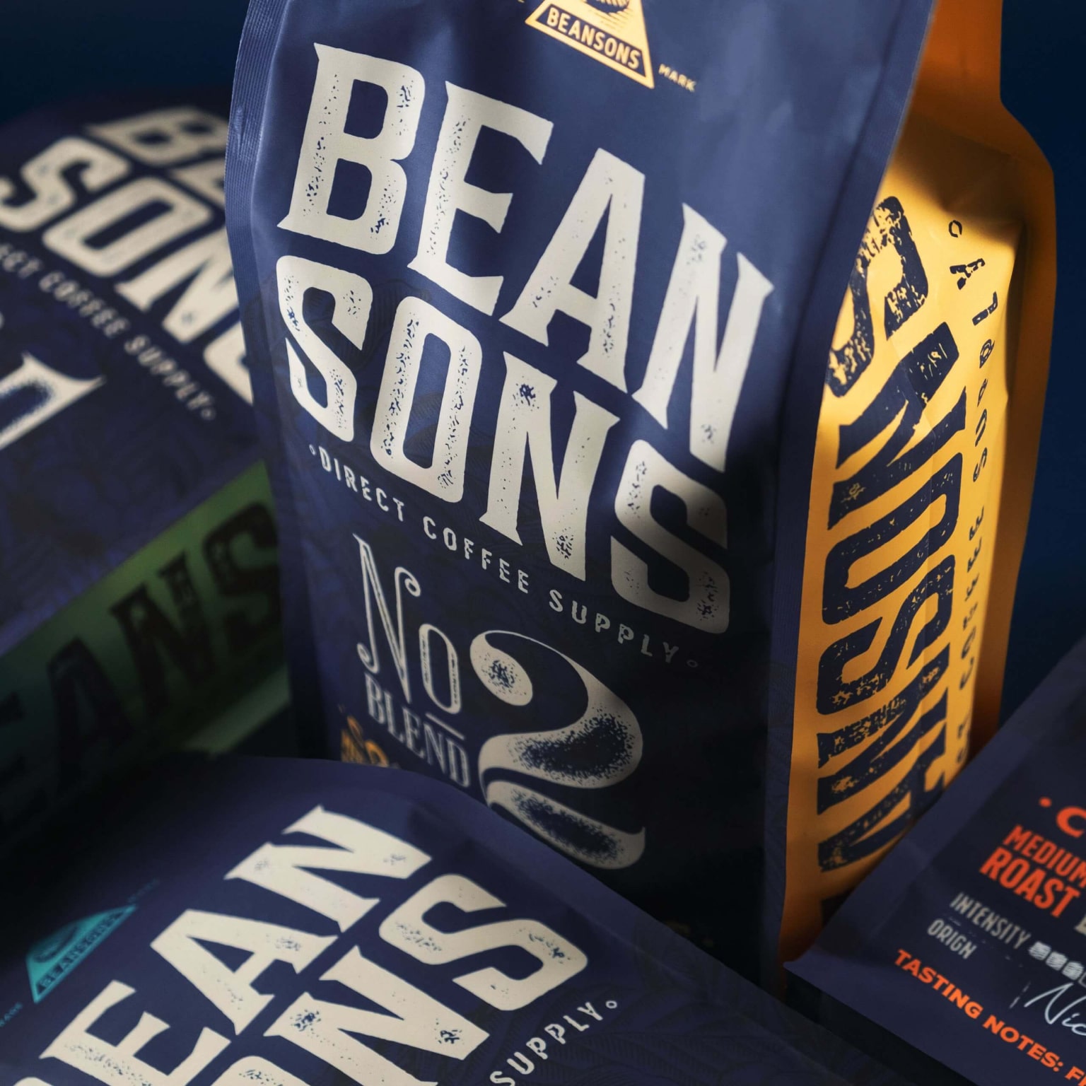
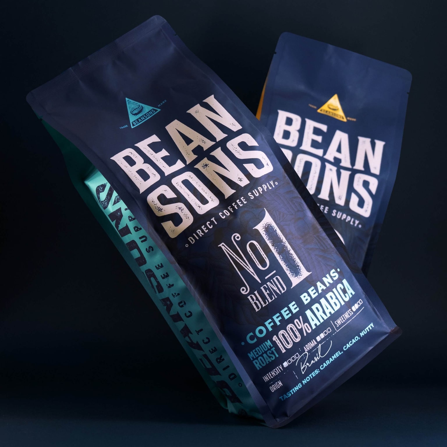
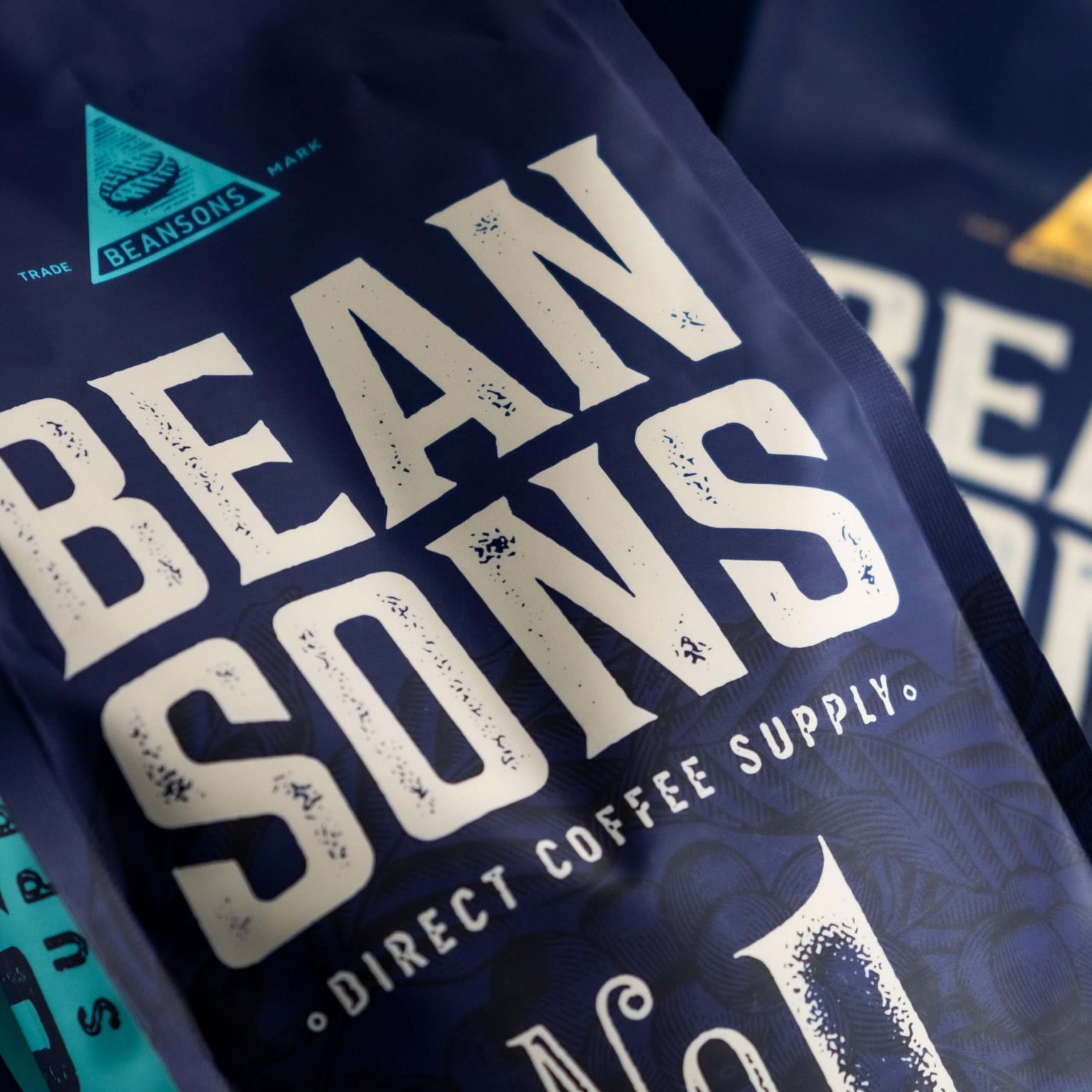
The name inspired the packaging style, combining classic and handcrafted graphic elements. The logo is a classic wordmark with a subtle textured background. Each coffee blend is assigned a number, and the informational panel on the front indicates origin, flavor notes, and recommended use.
Results
A palette dominated by blue and white with matte varnish finishes defines the look, while blends are accented with metallic details. Attention to detail creates a vintage aesthetic. The elegant packaging reflects heritage and functions as a clear informational guide.
More Projects
Facing a challenge? Let's talk.
Contact Us in the Way That Works for You

Antanas Rimdžius
Projektų ir partneryščių vadovas
Antanas Rimdžius
Head of Projects & Partnerships
Antanas Rimdžius
Head of Projects & Partnerships

Book a Meeting at a Time That Suits You

Antanas Rimdžius
Projektų ir partneryščių vadovas
Book a free consultation and meet at a time that’s convenient for you.


