Challenge
This is an organic fertilizer product for homeowners and gardening enthusiasts who want to grow healthier vegetables and fruits or take better care of their garden.
Solution
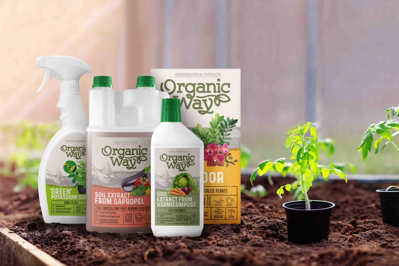
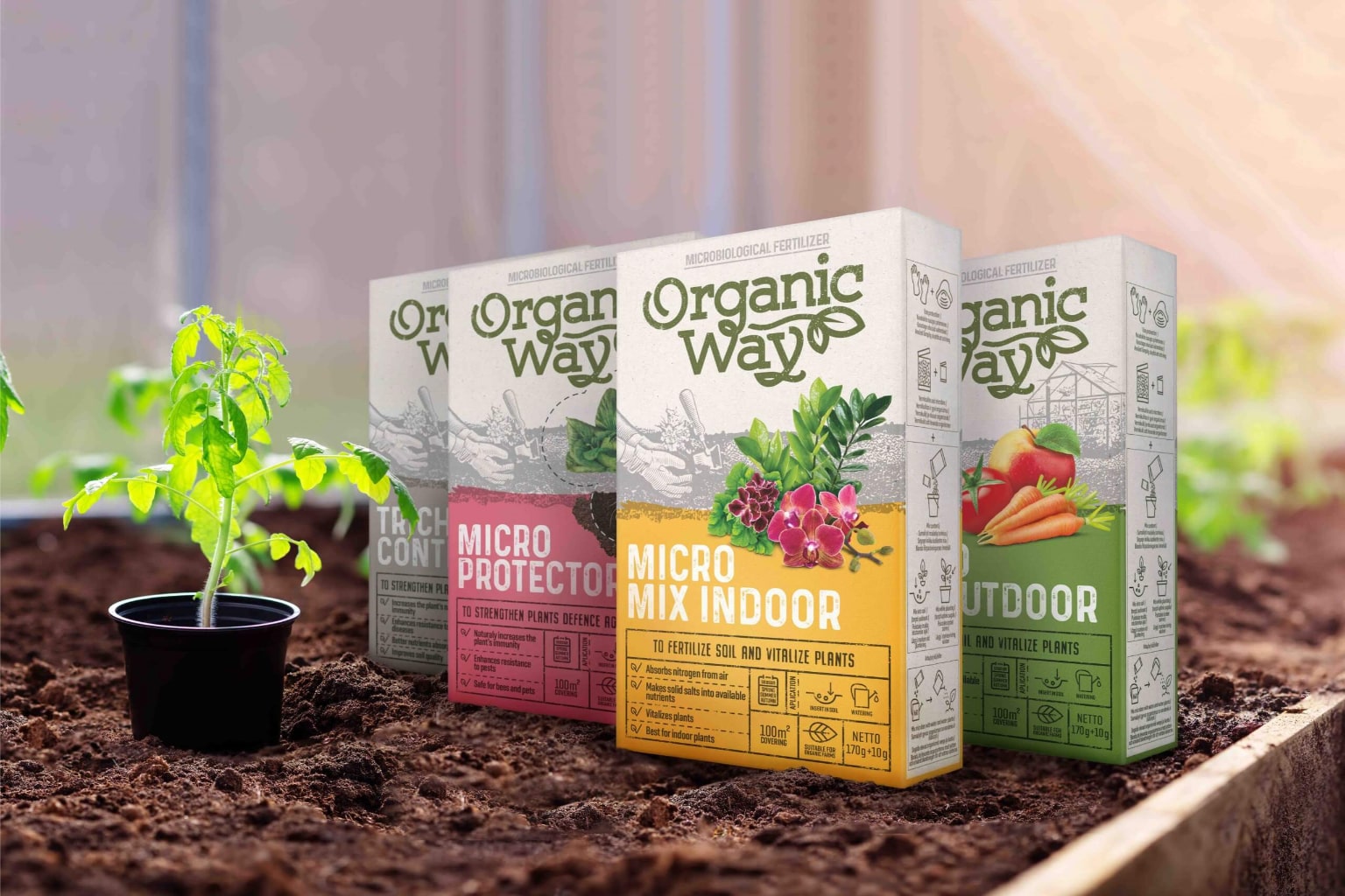
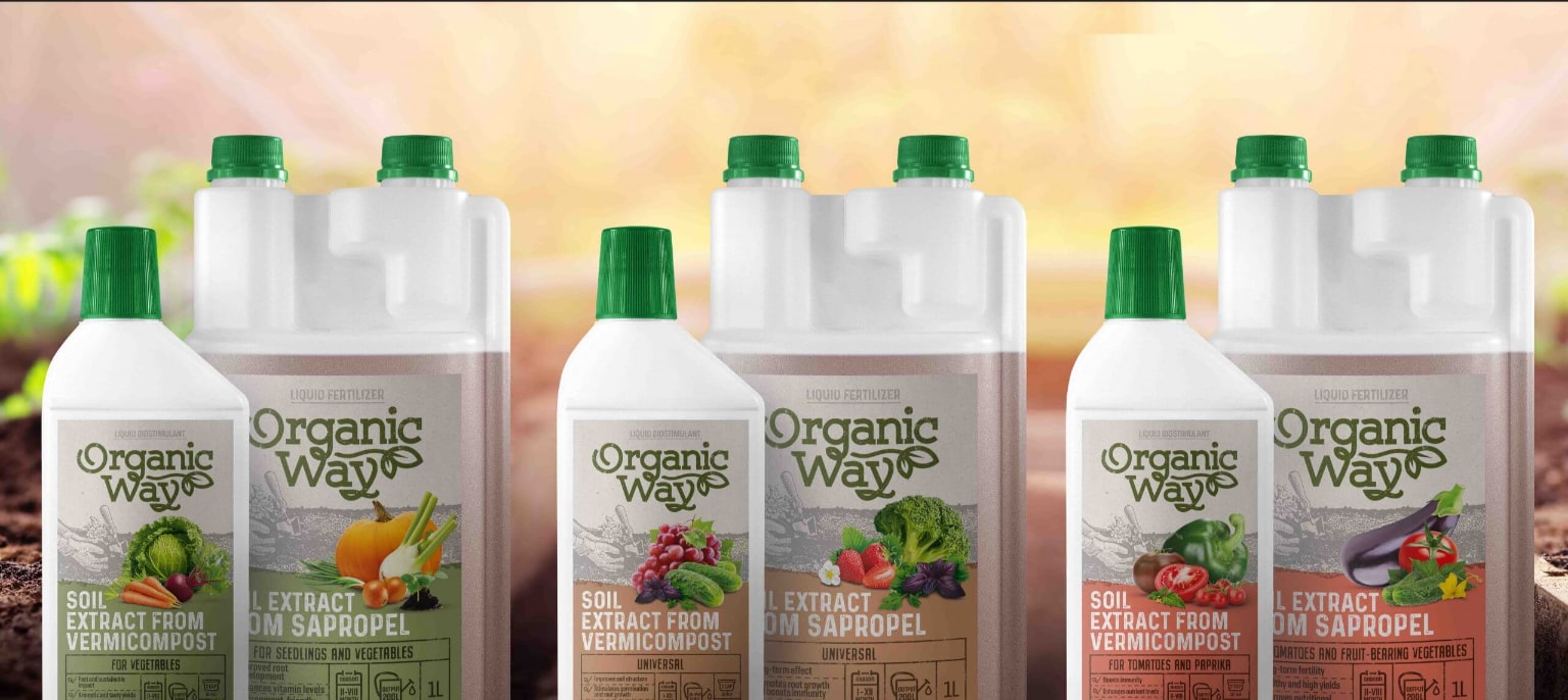
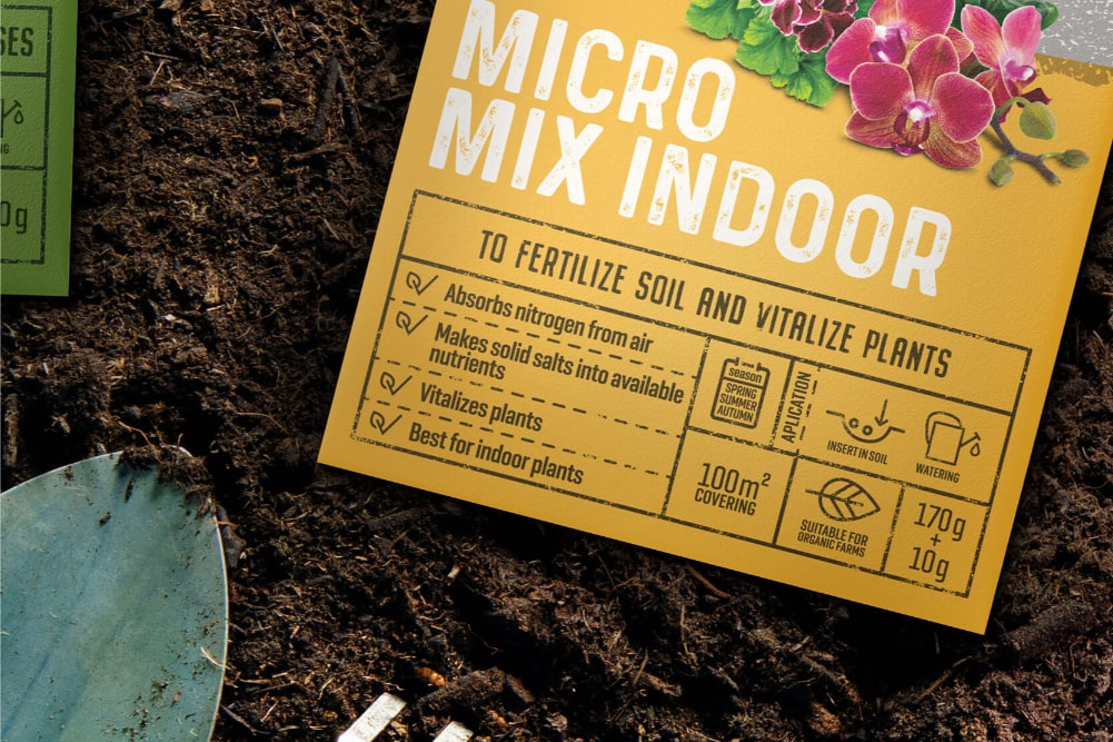
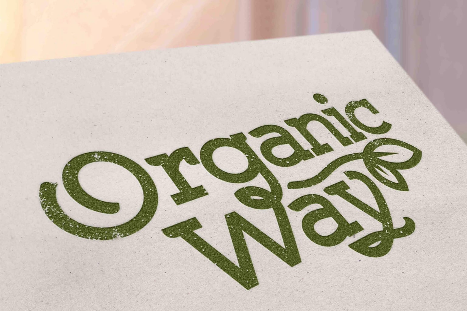
Special attention was given to the ORGANIC WAY logo, which was designed to visually communicate ecology on its own. The green color and leaf motifs signal plant-based, natural origins. A slightly distressed typeface was chosen to evoke associations with ecology, simplicity, and warmth. Colored kraft paper was used as the packaging background, creating a warm and natural emotional tone. Product information is structured in a table format, clearly presenting differences, results, and usage instructions. Large illustrations of fruits, vegetables, or flowers help consumers quickly identify the intended use of each fertilizer.
Results
The packaging clearly communicates ecological values and helps consumers easily choose the right fertilizer for their needs.

More Projects
Facing a challenge? Let's talk.
Contact Us in the Way That Works for You

Antanas Rimdžius
Projektų ir partneryščių vadovas
Antanas Rimdžius
Head of Projects & Partnerships
Antanas Rimdžius
Head of Projects & Partnerships

Book a Meeting at a Time That Suits You

Antanas Rimdžius
Projektų ir partneryščių vadovas
Book a free consultation and meet at a time that’s convenient for you.


