Challenge
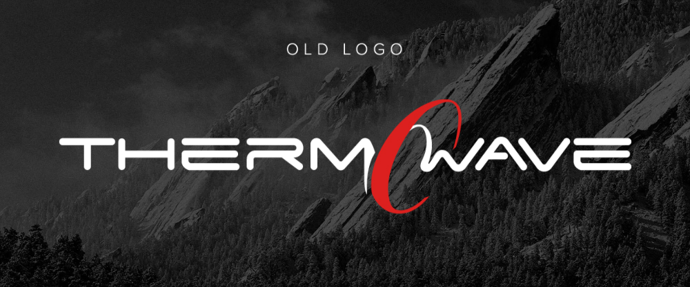
The THERMOWAVE brand was known to potential customers, but during its expansion phase several weaknesses became apparent. Analysis revealed key issues: an impractical wordmark composition, outdated and generic design, the absence of vertical and horizontal logo versions, no standalone brand mark, and a lack of communication about the brand’s core values.
Solution
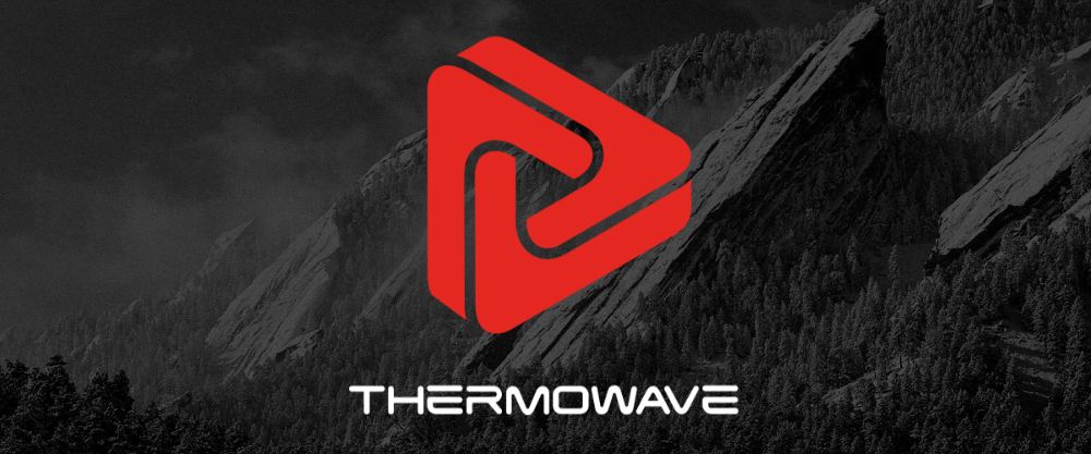
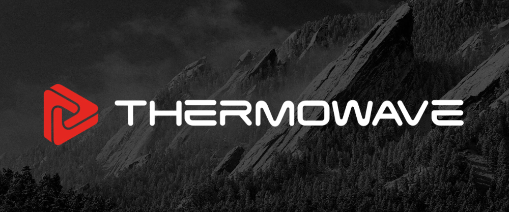
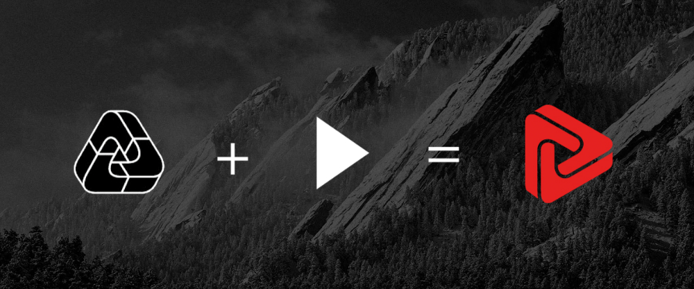
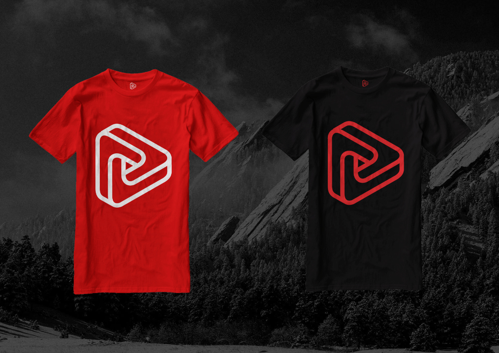
The logo was refreshed while preserving the unique original typeface, refined with subtle adjustments to make it narrower and more practical. Two logo compositions were created: a horizontal version to ensure a smooth transition for existing customers, and a vertical version to mark a new stage with a new symbol. The new logo combines an optical illusion with an arrow, representing movement and progress aligned with athletes’ values. The color palette was retained with minor enhancements, and brand usage guidelines were prepared.
Results
The refreshed logo eliminated previous shortcomings, strengthened brand recognition, and clearly communicated the ideas of movement and continuous improvement.
More Projects
Facing a challenge? Let's talk.
Contact Us in the Way That Works for You

Antanas Rimdžius
Projektų ir partneryščių vadovas
Antanas Rimdžius
Head of Projects & Partnerships
Antanas Rimdžius
Head of Projects & Partnerships

Book a Meeting at a Time That Suits You

Antanas Rimdžius
Projektų ir partneryščių vadovas
Book a free consultation and meet at a time that’s convenient for you.


